As Our Politicians Fight on Twitter, These 7 Graphs Show What’s Really Happening in the World
For this week’s article, I set out to do something different.
Rather than talking about an experience or promoting a project, I wanted to learn. I wanted to understand and share something valuable. And most importantly, I wanted to gain some perspective on the world we live in.
When I sat down to write this piece, I was feeling especially disconnected. I had just come off of an hour-long binger reading headlines ranting about what our politicians say on Twitter. It was appalling. To think this is what our society has come to is an utter disgrace.
Feeling frustrated, I started with a question, “How can we better understand what’s happening in the world around us?” This little project morphed from there.
I do hope you’ll find these blurbs interesting. Above all, I hope they give each and every one of us some much-needed perspective.
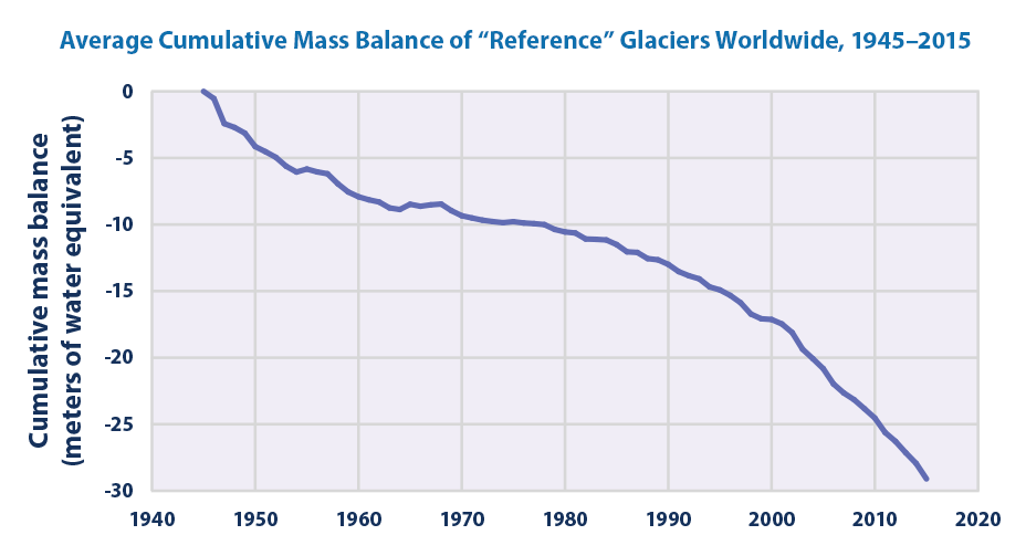
1) Our Glaciers Are Melting at an Astonishing Pace
Earth’s ice cover is shrinking. Polar bears are starving. Sea levels are rising.
If this trend continues, will that be enough to someday drown our major cities? I’d rather not find out.
PS — I pulled this graph from the EPA’s website (the very agency in the midst of a battle against the words “climate change”).
Source: https://www.epa.gov/climate-indicators/climate-change-indicators-glaciers
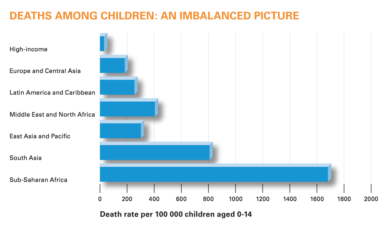
2) Child Mortality is Shockingly Unequal
More than half of early child deaths are preventable according to the WHO. With simple, affordable treatments, we can solve this problem.
Source: http://www.who.int/mediacentre/factsheets/fs310.pdf
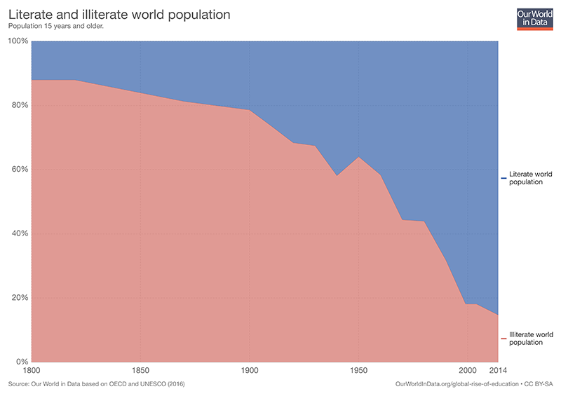
3) We Are Making Great Strides in Global Literacy
Don’t get me wrong… We have a long way to go in improving access to education around the world. But there’s no denying the situation is improving.
I think education might’ve been accidentally left out of yesterday morning’s Tweetstorm?
Source: https://ourworldindata.org/global-rise-of-education
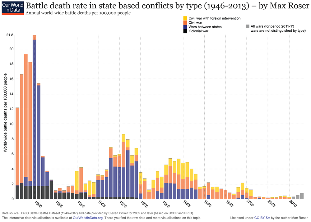
4) We Have Entered a More Peaceful Era?
An estimated 60 million people were killed in WWII. That equates to a staggering 3% of the world’s population.
Since that time, war has become far less destructive in terms of human casualties. That is not to say war is ever good, though it appears we have entered a more peaceful period for now.
Source: https://ourworldindata.org/war-and-peace/
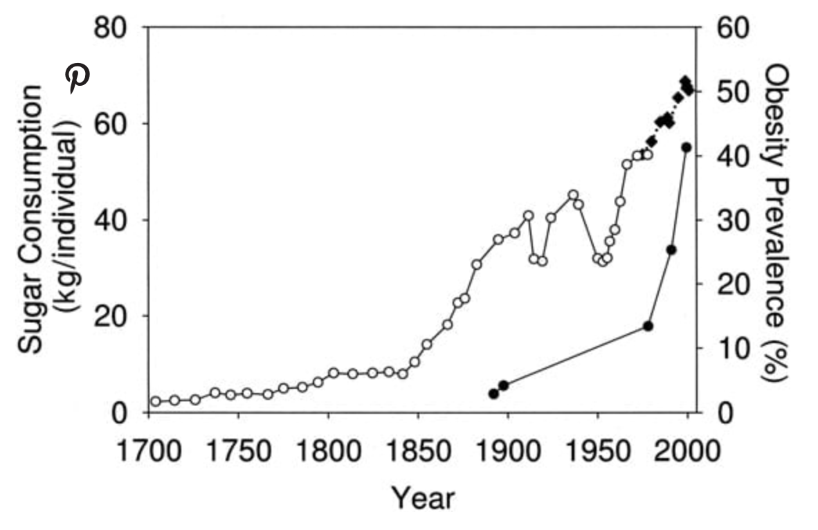
5) Our Addiction to Sugar is Deadly
I’ll let this graph speak for itself. We barely ate sugar in the 18th century, and now it constitutes a concerning percentage of our daily diet, most notably among children. Some experts go as far as to say sugar is the worst possible thing we can eat.
Source: https://www.healthline.com/nutrition/11-graphs-that-show-what-is-wrong-with-modern-diet#section1
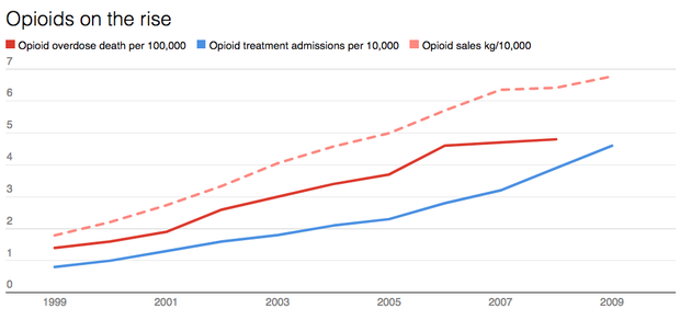
6) The US Opioid Epidemic Has Reached Critical Levels
Drug overdose is the leading cause of accidental death in the US. How did something so rare and preventable spiral out of control? Many blame pharmaceutical companies and doctors for an oversupply, but the bottom line is it must be stopped.
Good thing the person tasked with fixing this problem has zero public health experience whatsoever. How is this even possible?
Source: https://www.cbsnews.com/news/opioid-addiction-epidemic-in-6-charts/
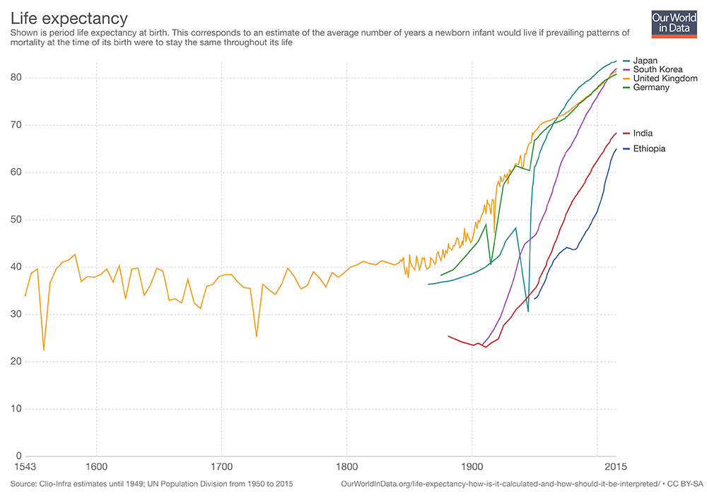
7) We’re Living Way Longer on a Global Scale
The lifespan in many countries has doubled since the 18th century. This is a tremendous advancement and will hopefully continue as countries become more developed, healthcare access improves, and health organizations continue their work in underdeveloped countries.
Source: https://ourworldindata.org/life-expectancy/